Vizzu, an open-source library for animated dataviz and data stories
Hi all!
After four years of coding and navigating the rough waters of bootstrapping a startup and finding the right path forward, our small team of Vizzu is at the best place it can be: We finally have our first product: an open-source library. (I admit, I might be biased here as an open-source enthusiast developer.)
We released Vizzu’s first public beta into the world, and I’d like to say a few words about why we think it is unique among the dataviz libraries and why we hope that you will love to use it as much as we do.

If you built animated data visualizations in the past, you had a big decision to make: You could go for a low-level library, most likely D3, which you could use to create stunning, highly customized animated dataviz, for the price of putting a lot of code and effort into your project. Or you could choose one of the high-level charting libraries, create static charts with considerably less code, and then animate a growing number (pun intended) of aspects of your chart.
High-level charting libraries are easier to use, because they implement the rules of data visualization (axes, legends, etc) and provide a high-level interface over this ruleset. Sometimes with a separate interface for each chart type, other times using the abstract interface of the ‘Grammar of Graphics’, like the Vega library.
We set out to build a dataviz tool, which offers you a third path. We think that the missing link for making animation a first-class citizen is to extend the data visualization ruleset into the time dimension, by working towards the Grammar of Animation.
As the first step, we created our engine that is inspired by the Grammar of Graphics, and provides a common interface for several different chart types. Then we looked at the parameter space of this engine and made each parameter interpolatable, turning our engine into a generic chart morpher, which can continuously interpolate between any chart types that can be described on its interface.
The second step on this road was to analyze these transitions and come up with rules that make them self-explanatory and easy to follow for the viewers. Finally, we built these rules into our engine to guide you through the mostly uncharted sea of dataviz animations.
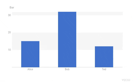
To give a little taste of the API, here is a small snippet from the readme. After you set your data of three data series named ‘Foo’, ‘Bar’, ‘Baz’, creating a bar chart is as simple as this:
chart.animate({
  x: 'Foo',
  y: 'Bar'
});
Then you can transform it into a scatter plot by changing the data series governing different aspects of the chart:
chart.animate({
  color: 'Foo',
  x: 'Baz',
  geometry: 'circle'
});
We still have a lot to do, but we believe we are at a big milestone, as now we can give you a tool you can use to build highly animated data visualizations easily. Check out the examples and the tutorial, and decide for yourself.
If you want to learn more about our results on the path towards the Grammar of Animation, check out Peter’s talk later this week at Crunch conf.